

Imagine your online users pinching and zooming your website on their smart phones to review your services. You will definitely not like them going through such a painful user experience. The whole concept of providing exceptional services is derived from the value of customer satisfaction. Researches uncover that 48% of internet users view that a site which does not function smoothly on their smart phones exudes a feeling that the company doesn’t hold its business important enough.
If your users are not satisfied with your website, chances are they will rarely opt for your services. The responsive web design trend makes sure your internet traffic coming from tablets or smart phones is retained on your web front.
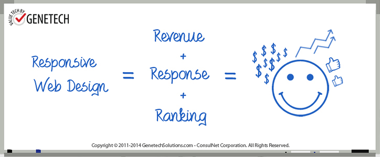
Revenue
The number of responsive web design success stories are increasing each day. It lessens your bounce rate thereby increasing the average time spent on your website by a user. Many famous brands have augmented their revenues by boosting conversion rates hence achieving their financial goals.
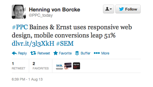
For instance, let’s take a look at the Skinny Ties. We have already labeled them as one of the most inspiring product showcases but the site achieved immaculate revenue growth on all devices (by 42%) and increased their conversion rates on iPhones by 71.9% after making a leap to get their website responsive. There are many other companies and brands with increased conversions and decreased bounce rates which owe their success to their responsive website. Look at this tweet announcing a company’s amplified online presence after a responsive design.
Response
Did you know that 78% of online users wish to find their desired information on a mobile site in just two clicks? Also, 64% of users prefer scrolling down a website rather than going left or right to find what they came looking for. These are important statistics for both your Services and Blog pages. A visitor may somehow land on your website through a viral infographic or one of your most popular guest posts, but after that it’s all up to the responsive design to retain it. If users can easily maneuver through your website, they will most probably stay to find something which is of interest to them. Moreover, if your web front has a company blog offering insightful updates related to your niche, users can subscribe to it and keep coming back for more in future. Responsive designs respond to devices but viewing it from a different angle, users too respond to responsive designs!
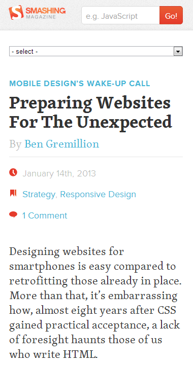
According to Nielsen, more than 60% of the American mobile phone owners posses a smart phone. Statistics also inform us that by the year 2017, the number of people using mobile phones will be no less than 5 billion! Take a look at how the Smashing Magazine website looks when it is viewed from a mobile.
Ranking
Google warned you and online marketers offered you! The past year is evident of the skyrocketing increase in the adoption of the responsive trend. Matt Cutts informs us that for SEO purposes, the responsive design is the better option as you may face difficulties developing a mobile version of the site if you aren’t implementing it accurately.
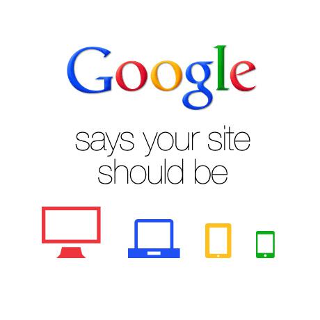
In 2012, Google recommended it to be the foremost strategy for smartphone-optimized websites. It can strength your online presence with no additional app development. Google wants to redirect its users to the websites which offer hassle free accessibility and are made out of all the necessary UX design elements. Just think what harm your non-responsive design is doing to you when a user goes back to the SERP’s looking for a responsive site abandoning yours. To rank better, you have to design better. The responsive design has definitely become the better part of the web design industry.
The best time to start creating a better future is always today. A responsive web design will make sure your users are retained and guarantees conversions which are already proved above. Respond to the need and get responsive today!
Images Used:
https://i.imgur.com/w3FuSLw.png
http://d1avok0lzls2w.cloudfront.net/img_uploads/Smashing%20Mag%20-%20Mobile.png
http://bloggingexperiment.com/wp-content/uploads/google-says-your-site-should-be-responsive-460.jpg
Amber Alvi is a professional content writer for Genetech Solutions, a client committed Software Development Company offering exceptional Web Solutions, Android/IPhone applications, SEO, Social Media Management and other web services. Follow @AmberAtifButt for more web and marketing related updates.