

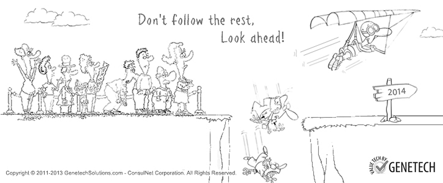
The World Wide Web celebrated its 20 years of existence in 2013. Since the time it was made available to public for free on 30th April, 1993, the web has continued to develop. We have been in awe of web developments occurring in the past and the future also promises to hold endless possibilities. This makes every year witness major developments and changes in the manner websites were being designed in the past. While the year 2013 focused on content driven websites along with Scalable Vector Graphics (SVG) and Responsive Techniques, the coming year 2014 will unite the web developers/designers all around the world to design and develop websites which can be accessed on all available platforms and every channel. A user friendly interface with easy navigation and accessibility options will be the key to a popular website.
Let’s see which factors will make your website compatible with the year 2014:
Flat is Back
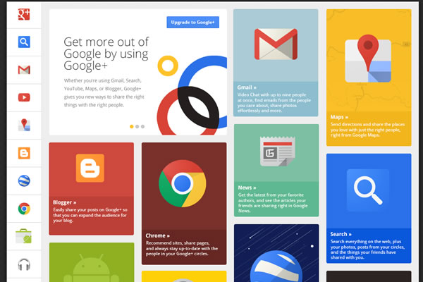
Gone are the days when web designers preferred using objects popping out of their websites or shadowy text fonts in an attempt to provide users with a simulated 3D experience. The need to make a website accessible to all platforms has made web designers return to the basics. All smartphones and computer screens are flat. Hence, a flat but solid design with harmonious color tones, a minimalist interface, creative typography and less gradients make a web design fit for the year 2014.
Responsive Design Receives the Right Response
The most talked about trend in 2013, responsive designs, will be the most sought after element for a website design in 2014. The web design industry has transformed immensely in the past few years and the future looks promising for the responsive design trend which easily rearranges layout elements and resizes images and form elements to transform a design to fit a large number of screens. The number of users surfing the internet from their smartphones or tablets is increasing day by day. Such growing percentage of users will ultimately call for a web design which can be viewed across all platforms. Websites in the coming year will be optimized in such a way that they will be fit for viewing on all resolutions and screen sizes.

Parallax Scrolling: Perfect for 2014
Derived from the Greek (parallaxis) which means ‘alteration’, the term parallax scrolling actually creates a 3D effect while you scroll down a web page. Although it is best effective when used in less proportions, parallax scrolling nonetheless is an emerging trend for creating eye-catching websites. Experts deem it as a cosmetic tool to leave a lasting impact on the minds of users and to add the ‘wow’ factor to your website. Having a compelling, interactive image that embraces a computer screen is a definite way to make sure your website packs a punch.

Large Images and Large Buttons: Large Audience
Already in practice, this trend is expected to be employed massively in 2014. Many websites use large and easily visible images and buttons especially on their home pages for a ground breaking first impression. In this context, backgrounds containing text along with full-width images are also getting popular and will gain more popularity in 2014. Large buttons facilitate users to easily navigate a website and is liked by audiences of all age brackets.

Single Page: Thousands of Users!
Frequently used in accordance with parallax scrolling, the name spells out its function. In the year 2014, a single page website will save a lot of internet time of always-on-the-go users and will promise more and more visits for its time-saving and easy navigational attributes. De-cluttering irrelevant content to create a clean and functional single page website will be one of the major trends of 2014. Many professional and business websites have already adopted a single page website eliminating the need to skip from one page to another. How the designers aim to pour all business content on a single page will reveal how popular and effective this trend will be in 2014.

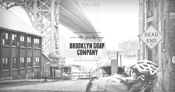
Mixed and Matched Typography
We already witnessed this trend in 2013. But, for any website to be updated according to the 2014 standards, different fonts mixed and matched together are sure to catch the attention of users. However, experts suggest sticking with one font in each larger typographical category. A good example of this is Brooklyn Soap Company with three font styles which are mixed together very aesthetically to give a fresh yet a professional look to the website.
For your business website to be compatible with the year 2014, these are some of the important factors which need to be taken into account. The year 2014 will observe new and emerging trends to be employed by web designers and developers to design user friendly interfaces and eye-catching websites which can easily be deployed on all platforms. Web developers and web designers have come a long way during the web development evolution and are continuously doing so to help the web design industry evolve in future.
Image sources
http://www.topdesignmag.com/wp-content/uploads/2013/05/14.-flat-design.jpg
http://engage.synecoretech.com/Portals/141995/images/Microsoft-RWD.jpg
http://www.101webdesigns.com/wp-content/uploads/2013/10/Oakley-Airbrake-MX-parallax-scrolling.jpg
http://www.webanddesigners.com/wp-content/uploads/2012/01/single-page-websites/smokeybones.jpg
http://www.wdstandards.com/wp-content/uploads/2013/07/flat-design-google.jpg


