


What makes a website click with its users and what fails at providing them a user-friendly experience? The answers may be too many but they all revolve around the same nucleus: usability. Usability is a key element of any UX web design. The components which must be incorporated into a web design to ensure user engagement have been thoroughly researched worldwide.
Some key usability features of a web design are listed below with examples.
1. Site Navigability and a Sitemap
If your site presents the users with horizontal navigation across the top or vertical options on the left, the users easily find their way into your products & services. An inclusion of a site map also lowers your bounce rate as users can easily find what they came looking for in the first place.
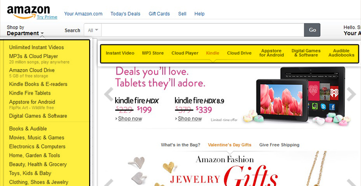
2. Logo as a Link to your Home Page
Your company logo must be included on the top left at every page. No matter how a user arrives on your landing page, he must be able to click your logo to reach your home page which lists a summary of what you do and how you wish to serve him.
3. Use Images for Branding not Decorating
Our brains connect to things which are relevant to us. Using images merely as a filling agent in your web design may take a toll on your users leaving them uncertain to create a credible relationship with you. According to researches, pictures of real people with a similar attire or appearance as your target audiences leave a more lasting impact on their minds.
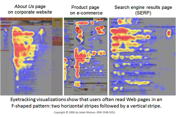
4. Content that can be Scanned
According to an interesting study involving eye-movement conducted by Nielsen, the theory that internet users are prone to read content in the form of chunks is supported. The pattern which our eyes follow in this attempt is an F-shaped pattern. This pattern can also appear to be E-shaped at times.
This naturally means that a web design loaded with tons of content is a big No-No.
If you want your users to ‘read’ your services rather than skim through them, make sure to follow this tested pattern.
5. Short Registration Forms
Tedious registration forms are sure to put your users off. You must ensure that if your website has to include a registration form, it is clearly visible on the site and also involves less clicks. Users are happy to register for sites offering short and sweet forms.
6. Time Saving CAPTCHA
Short for ‘Automated Public Turing test to tell Computers and Humans Apart,’ a Captcha’s main idea is to differentiate humans from computers. But humans like simplicity! Some captchas may be too complicated to copy. It must be easily readable and solvable by your average user.
7. Catchy Typography
Designers have experimented with creative use of website typography. In most cases, the most user friendly typographical designs engage a minimal number of elements by using only one or two fonts. Using a single color and changing the font size to emphasize or highlight any particular service induces a welcoming affect on the user.

8. Reasonable Load Time
Web designs which take forever to download may force users to abandon your websites. One of the reasons to speed up your website is that if your it doesn’t load in 4 seconds, 1 of 4 people will leave immediately.
Sure, we all have broadband now, but technology has also thinned down our attention span making it impossible to wait for flashy images or data to load. There are many ways to reduce the load time of your website. Seasoned designers and developers make sure they employ appropriate compression techniques to speed up your site.
9. Make your Services not just Visible but Accessible
Now that your website has all the other usability features incorporated, how will your users contact you? Businesses which keep on preaching about how remarkable their services and products are but do not provide any solid link or method to create easily accessible options have slower conversion rates. Make contact forms or links ‘available’ to your users on every potential web page.
10. Make use of the White Space
Some web designs are polluted with a lot of elements turning websites into a hotchpotch of several objects. For your website to be user friendly, you need to simplify the layout of your web design by un-cluttering it. A high percentage of white space means your website is easy on the eyes and lets the user go about your website effortlessly.

Use Click Heat Maps Regularly
You’ll never know what’s working for you and what’s going against you unless you don’t keep track of the features your users are clicking. A number of popular click heat map apps allow you to:
- determine the most click-able links in your navigation and make sure they are grouped together
- spot out the least popular links in your web design for you to either make them more evident or remove or change their location
http://cdn.business2community.com/wp-content/uploads/2011/07/f-shape-reading-pattern.jpg
http://adsoftheworld.com/sites/default/files/styles/media_ng/public/images/stampa_inglese.jpg?itok=UTpTRaCT
http://www.amazon.com/
http://blog.teamtreehouse.com/wp-content/uploads/2012/11/whitespace03.jpg


